Category Archives: ASSIGNMENTS

Assignment 5/ D1 overview.

My progression throughout this course has been one of deconstruction. My representational drawing skills were already well informed before I started the course, my ability to interpret this information into a more expressive piece was lacking.

My major concern, was the ability to create a sketchbook of work to put into a final picture, I felt this was my weakest area, it is still something I need to work on. I am still coming up with ideas and experimentation on the final picture, but it would not be as layered a response if I had not done a tight sketch that showed me what the major lines of an image interested me enough to do the picture in the first place.

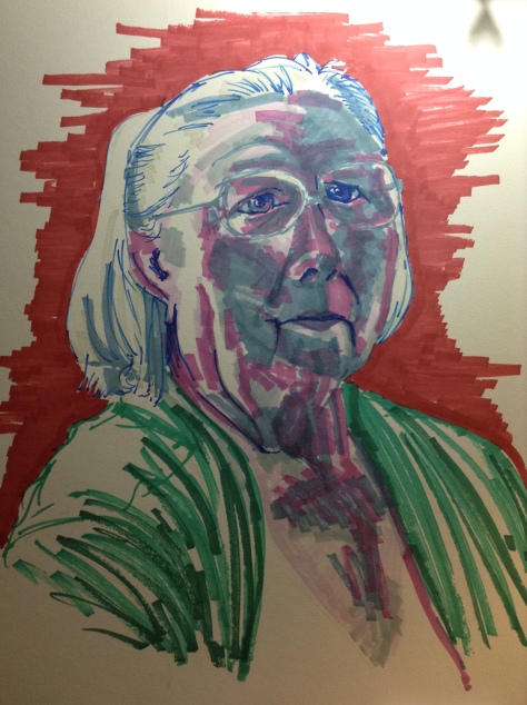
I have come to accept my mistakes as potentially happy occurrences rather than the ending of a picture and by mixing up the mediums I’ve used to create with I have played with a colourful mess which has really ruined the lounge rug. But I hope long term will look good on the walls of friends and families who have followed my progress in the last year on my Facebook timeline.

My use of language to describe what I am attempting to convey has progressed well, an understanding of the major art movements was never going to be instantly learnt but every artist that I’ve looked at and and read about in this last year has fascinated me and taught me more. having moved out the bedside table before Christmas to fit in a bookcase, I find I am yet again in need of another to clear the floors of 2 rooms.

I haven’t seen as many exhibitions as I would have liked, as much as my children don’t have a particularly low boredom threshold, my purse isn’t bottomless, I have to be able to bribe them with a trip to the attached shop every time and London is an expense too far,. However I have discovered some well curated sites at an acceptable drives distance that have afforded me a chance to look at work close-up so I can assess techniques and steal like an artist (not a long book, but it whiled away some time and a glass of wine at Waterloo, waiting at my one and only train trip to London on an OCA drawing trip)

The ability to immediately look up an artists back catalogue online the moment I’ve finished in a gallery has helped me further, good quality photos exist and contemporary artists who list their work online have this handy how it looks in a room feature attached so you can judge the effect of a piece, even if you aren’t able to be in front of it.

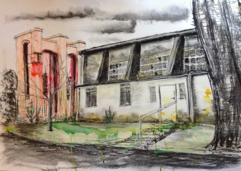
Which finally leads us on to Assignment 5. I don’t have a final picture that sums up the whole of my efforts. I could quite happily keep on producing pictures of the cathedral ad-infinitum. I originally planned to work around the outside, but this is England and it gets a bit soggy so sometimes when I got to draw there, I headed inside, then I worked out I was kind of spiralling in from a distance anyway, the view from the A36 with the road signs is probably as close to a Dennis hopper as I can say I got, the view from Culver street car park places it in its surroundings well, but I sparkled it up so much I think it lost the simplicity of Hoppers work.

The closer views inside the close are more reminiscent of Monet, the views I picked, the pastel version being the best, without going for a lot of repeats in different lighting situations.

I think I succeeded in my initial desire to achieve pictures of the cathedral that are a step removed from a (to me) tired sketch back along the old town path where the cathedral rises from the water meadow. I think I have given my pictures energy, the side door up to the roof being a major favourite of mine, as are the gate to the close and the altar pictures. My exposure to a near constant stream of John Piper pictures at various venues has kept me on task to look at my use of line and shade to add a sense of depth. This I feel is most apparent in the long view of the altar in blues and greens, the arches repeat themselves over and over.

The chapter house has been a joy to work from, the light inside and out through the glass creates merry hell on the contours of the building and roof which I have enjoyed.

Which brings us on to scale. I realise my work has gotten a bit big with this assignment, the building is itself not small and producing something that gives a sense of sheer size and weight to the stone meant going large. the final picture as delicate lead-work just did not need to be bigger than A2, so it isn’t.

The work in part 5 certainly would not exist without parts 1-4 being before it and only picking up to 15 pictures to represent my growth throughout the year is going to be hell.

Assignment 5

Investigating Salisbury Cathedral as a building, with a view to creating images that represent it in a current style.

The building is squarely at the centre of my world. Ignoring its theological purpose, the council won’t allow anything to be built taller than it so it dominates the landscape. The buildings that surround it are -for the most part- listed buildings that really are the same as they where in sketches from centuries ago. It also represents a part of the tourist trail that feeds the coffers that keep the parks looking good and the view from the coffee shops clean.

To me, it represents Home. Driving into the city in any direction, the sight of the cathedral fills me with a sense of calm you only get when you know you are about to throw off your shoes, find your favourite mug and shrug off all the duties being outside the house entails. I walk into town with or without my family and bump into a miriad of people I know, there is a reason we call it Smallsbury. Thats why I’ve picked it to draw.

I’ve been looking at the work of Andrew Wyeth (extensively over the last part of the course) and Dennis hopper in reference to open spaces and the importance of the items within them. This building sits in its landscapes in a way Wyeth and Hopper would approve of.

I’m also looking to the work of Degas and Monet to look at colour and light and the cathedral will work well for both these artists, given Monet’s Rouen cathedral series working with colour will be a nudge in a different direction.

I have recently seen a fair bit of the work of John Piper and his work is going to influence this assignment, the use of line and shade in his compositions brings a style that is far removed from the Constable and Turner pictures and most of the versions of this grand building I have seen since.

I want to build a strong sketchbook of reference images that I can then build into larger multimedia drawings that hopefully show the quiet of the places I have drawn. I had good success slowing down the sketchbook images for precise dip pen and ink sketches in the coursework for part 4, I want to keep working in this way, it led to much better final pictures.

There are strong shapes that define the stonework and hold up the spire which was never in the original design, using these to give the age and weight of the building will be a challenge I am looking forward to.

Assignment 4 picture 3

My grandmother has been a recurring theme in this part of the course. I have drawn her with differing success previously in the sketchbook so seemed to be a good choice for the final assignment piece. I played around with the light and picked the lighting from above so the shadows on her face could pick up her features.


IMG_8818

I wasn’t keen on the profile view and chose an angle while gran talked to my mother. This marker version is best described as wonky but between this and all the other sketches and a photo taken at the time I continue on..

IMG_8845

I have another sheet drying now with tissue and patterned wrapping paper on adhered with matt medium. I want to combine some perm marker and charcoal over it to see how it works. I will probably need to use white acrylic to create the highlights in that one.


IMG_8868

I ended up using gesso, over stuck on paper (majority was gold tissue), permanent markers and charcoal and Conte crayons. The portrait is atmospheric and the marks fresh enough not to make it looked overworked.

The original willow charcoal didn’t like the onslaught from the fixative and the gold shows through in patches on the face. I prefer to view this picture closer, it seems happier to me then.

I like the way all of the paper is covered, the picture feels whole. The features come out along with the preceding shoulder and the lighting is effective. There are a range of emotions at play. The mid section is darkest with the eye pulled up to the eye level, partially because of the striking white hair. I changed the colour of grans cardigan from orange to green so it was at the same interest level as the gold, the warmest part is then the added peach and red in grans face.

Doing this again I would gesso all of the face so I had better purchase for the conte, I wasn’t planning on using it, however marker pen wasn’t showing up as well as I had hoped. I also wasn’t planning on ending up with a relevant flesh-tone however, the gold stumped me slightly and this is my gran. Turns out I didn’t feel I could do her justice otherwise.


Assignment 4 (pictures 1 & 2)

Assignment 4 asks for 3 pictures.

1. A line drawing in A1 has the potential to lack punch from a distance if the line isn’t visible further than 3 feet away so the medium chosen for the drawing was at least as important to the pose. I wanted quite a crisp line so used the fountain pen for the sketches to sort the angle, the side on was too whistlers mother and the back removed the potential for getting the features wrong. I went for elevated to the side as this posed some interesting problems with foreshortening in the chair as well as the model. Animating the model was probably a step too far for my daughter (who I now owe a new nail varnish to)So you get a quite relaxed pose that lacks any kind of emotion except in the hands clutching the edge of the cardigan.

DSC01039

The angle meant the head fit to the toes 4 times and it didn’t look correct, so I extended the chin down and to erase the exsess lines whited over with acrylic paint. Would probably have helped if I hadn’t used cream cartridge paper.

I added the background to fill out the image and I like the odd angle of the rug in placing the chair, it has a feel of Van Goghs chair or his bedroom in Arles.

I tried it in charcoal but wasn’t happy with the thickness of the line, I didn’t want to use a paintbrush and ink as this is Drawing 1, not Painting 1. Pastels could have worked, but I still have concerns over their stability for transporting twice without the protection of a window mount. So I went for the pitt pens over the permanent markers, mostly as they are more expressive and responsive in the line.

I used a couple of greys, getting steadily darker as I became more sure of my line and finished off the edge with a black. This build up in the line has helped make it more important on the paper so the figure and the chair stand out.

Am I happy with the picture? It doesn’t look like my daughter. I have drawn Sam many times over the last few years, with much more success in the likeness than this, I chose a permanent line I can’t correct so accuracy without repetition isn’t going to happen, which is annoying as I am happy with the proportions in the body and the chair. This captures a moment in her life of mild visible insecurity at yet again posing for mum, she is enclosed by the arms of the chair which I think gives it as an object more power in the picture.

My greatest problem is what the picture lacks in tone, one OCA student on the facebook page suggested it would make a good illustration on a book cover and I can see his point. Its a picture, but it feels flat without the shading I would have put in place to round out the form.

2. Lying down in tone. This was done at life studies and I’d say was a bit of a fail, I shouldn’t have done the outline of the form. I chose charcoal as its a quick filler and I’m not in charge of the pose or time so speed is of the essence. I achieved 3 quick sketches around the sofa before settling on one that foreshortened down from the head, this gave an interesting line in the leg and because of the angle in the lamp a more appealing reveal in the head.DSC01038

This model has a marvellous way of holding himself and given his age, has great lines in his muscles and bones to make up the form. However I think they are better shown when he is sitting or standing and holding himself in tension. It is a successful sketch of the human form (even if it is unclothed against the requirement of the assignment brief), however I think I might be rightly told off for all the lines.


Assignment 3

Assignment 3 was based around Old Sarum Airfield, its a collection of ageing huge hangers and support buildings that stop abruptly at the grass strip for the planes. Some of the hangers have been done up and the one I chose to draw has not. It is surrounded by industrial buildings some from the same time as the hangars, leading to the modern day (the garage my car goes to is at the other end of the road from this hangar).

I sketched before lunch on a gale force kind of day in December. I positioned myself over the road and my eyelevel was below halfway on the ground floor windows

My preliminary sketch-work centred around drawing detailed elements so I could recognise them later. I took photos which show clearly the elements I left out. I was fascinated by the angles created to make the structure work, and the obvious decay.

I left out the overhanging tree as I wanted to concentrate on the building, ditto the trees behind the brick structure  (that holds the hangar door runs) I’ve enjoyed playing with inks and wanted to take the colours more real to the actual image but didn’t want to aim at an exact match, I also prefer the more random effect of laying the colour first then creating line over. I have to separate the 2 layers with acrylic matt medium as otherwise there isn’t enough tooth for the charcoal and conte to get purchase.

IMG_8113

Again I haven’t put focused detail into the foreground or whats behind the building, I’ve made the whole thing fill the page rather than show the industrial elements around it, to me it gives it more of an open point in time that it can be from. There is visible angular perspective at work.

I think I have shown an element of a functioning building that is dilapidated and I think the acidity of the colours helps that. I think the only emotion I get from it is a sense of sadness for what was once a hive of activity and the knowledge that to afford to bring a building of this size back to its grandest best must be cost prohibited.

I think it shows where I have come from so far in this part, because it is nowhere near as perfect as I would have produced previously and has much more atmosphere as well. This is the effect of Moore and Virtue, with my interpretation on top.

Given the picturesque nature of my city, I have tried to stay away from the chocolate box image, I’d say I have been successful.

From an assessment point of view, I would say I display good technical knowledge and visual skills. I would say I am happy with a large majority of the pieces I have completed and they have a voice and create an emotional response.

My weakest point at the moment is still in creating a body of background work that informs the final piece. the sketchbook work is coming on, but I am aware I need to show informed decisions on final framing of an idea. Its difficult though as I carry a photographic device with me for all these exercises and photo  scenes and frame in my mind at that point after looking through the viewfinder. This informs which rectangle or square of the landscape I will try to sketch. This does not mean I haven’t frozen my bum off sketching and just worked off photos, it just means the act of taking the photo decided which bit of the view ended up in the final piece.

I found reading up about the history of landcapes very interesting, I still don’t get the point of the golden mean, I understand what it does, I’m just not convinced I have the patience to put it into affect…

I’m on ‘The shock of the new’ at the moment, its a longwinded number but its explanations of the history of modern art are detailed and informatiove, detailing what could have been happening around the movements to define there direction. I’ve a long way to go to finish the book though.

D1 Assignment 2

  • the use of colour in drawing
  • the most appropriate medium for the subject
  • composition and context
  • mark-making and contrasts of line and tone
  • accurate and expressive depiction of form
  • experimentation with idea, material and method.

Looking through my sketchbooks for this part, I had a great deal of fun with different mediums, some I had not touched for a long time (oil pastels and pencil crayons). others that where new (permanent markers).

It is an eclectic mix of exercises making up the projects so picking one is a bit like a minefield. Interiors was initially a definite no, mostly based on the message in a picture potentially being quite bland.

I will spend more time drawing horses, mostly as at least one of the major pictures I offer up for this part will be heading in the direction of the models owner after assessment and partially as I haven’t drawn horses enough to say I understand the way they are made up, to be able to instinctively understand the shape of a movement yet.

Still life as a section was huge, I enjoyed most of it, I believe I achieved a range of final images that complete the exercises with imagination and life and with pictures like the mackeral I can envisage a series of pictures rather than the one I completed.

My chosen subject was to be my Grandads toolbench, recent family happenings (at 93 he tried to do some DIY mis-judged a situation with a table saw and is now banned from electronic power tools and his garage is going to be cleaned out, partially to dissuade him of the notion of trying again. Its OK, the bandages will come off eventually) Making some sort of record of a place and series of things that have defined him so long spoke to me as something I could achieve.

I had two long sessions of sketching in the garage and after the first line study realised that there is just too much going on on the bench to do a wide-angled interior shot, it would take a piece of paper the same size of the desk to catalogue most of the items and the set-up he has created, having a hint of Heath Robinson about the space.

P1050861

So I sketched some specific items and angles to view them at. I also took photos to help with the time in the space. I chose to go with the light through the door rather than putting the overhead or spot light on, I preferred the lower light and softer shadows of the space now unused.

P1050859P1050860

I wanted a surface that was already used so lay down written sections of newsprint onto an A1 heavyweight watercolour sheet, I then sat back and looked at my sketches and the photos and the one that struck me was the can in a can. Its just a random thing on the table but it shone out and even my Grandad can’t explain or remember why he put it in there which sort of sat well in the clutter for me.

I’ve had good success over this part of the course with line over colour, I wanted this to be another multimedia piece, but wanted to stay away from loose washes of colour. Also, as much as the sketchbook pictures were mostly coloured fine tipped pens, they were only from WH Smiths and have an unknown reaction to prolonged light which is a shame as I was happy with the colour and strength of the pictures, I wanted to represent the untidiness by covering the paper with its shapes and angles, and after initially doing a pencil outline of the can in the centre and gesso-ing it, I made it larger, I realise this makes the objects around even more indistinct and a jumble, but I really wanted the focus to be this can.

The picture was completed with permanent markers and fine-liners and for its size is a strong image, the colours ping out and I am really happy with it. I am slowly learning to develop the finished story through the work behind in the sketchbookIMG_7401

I think this assignment shows progress from my initial piece, I am experimenting with materials and learning which ones work for me. I don’t think I have achieved as much benefit from the research points as I have from reading books externally to these,

A Closer look Still Life Erika Languir, 2010, National Gallery Company Limited.

Looking at the overlooked four essays on still life painting by Norman Bryson, 1995 Reaktion books LTD

Viewing Renaissance Art, arranged by Kim Woods 2007 Open University press

Cezanne, (this was a cheap little book that gives a thin account of his life and practise as well as a good range of his pictures over the time, it also does not list the author or arranger of  the work) 2005 Grange books (good catalogue of images though)

sections of 2 open university books kindly lent by a friend, Reputations, edited by Elaine Moohan 2008 (section on Cezanne)

and Art & Visual Culture 1850-2010, Modernity to Globalisation, edited by Steven Edwards & Paul Wood 2013 reprint by Tate publishing for Open University. Parts 1=3, detailing a view on the move from impressionists onwards through Japanese prints (which definitely had an impact on Picasso)

Blitz and Blockade: Henry Moore at the Hermitage.Fontanka; 1st Edition edition 2011

Picasso’s Drawings 1890-1921 (Yale University Press 2011)

I’ve also now got Betty Edwards Colour book on the go (2004 Tarcher/Penguin), as much as this is going to be an excellent book for the painting course, and its giving me an awareness of tone and chroma, I’m not sure where its going to lead me in D1.

Growing up The young British Artists at 50, Jeremy Cooper 2012 Prestel Verlag. as an introduction I understand to some people I didn’t think I did.

I am also about halfway through Writing on Drawing series editor John Steers published by Intellect Books, which is a mind bending little read. I am beginning to appreciate alternatives I would have dismissed like Armando and Picasso because of the understanding I am reaching through all the reading.

I’ve also got the catalogue for the Great British Drawings exhibition at the Ashmolean, its a tome. printed by the Ashmolean mostly written by Colin Harrison and was an exhibition I went to as an OCA trip. I haven’t written it up and there wasn’t time whilst walking around with the other students to sketch but between the Ashmolean and the exhibition at MOMA that day it was an eye opening experience around the variety of art this country has created at an amazing skill level. We were advised to look at pictures and work out if they were finished pieces or supporting sketches. Fascinating!

D1 Assignment 1 A personal still life

Choosing objects to draw has been a challenge all of its own for me. The key was an easy choice, it represents my ability to do this course in the first place, its the gate key to the site where I work, a place without which I would not have remembered I can paint and draw in the first place. Through two of the schools onsite, being given back some of the confidence that eroded through 6 years of full-time motherhood and general marriage, plus the financial ability to pay for this higher education. I’ve attached the keyring as it was a gift from a leaving pupil in return for a painting of a duck I handed on. I think it adds weight to the key creating a larger impression around that object.

To me the shell represents time with my children on Boscombe beach. its a thing I try to do most holidays, we are only 45 mins away and its a beautifully non threatening place to go. Sam and Jamie go play in the sand, I can sit and keep an eye on them and either study, draw or read.

This leads to the cup. A V&A porcelain mug I picked up in the staff shop when I worked at Waitrose. I originally had two, that didn’t last long. I like drinking coffee out of porcelain, same as I like drinking water out of a stemmed water/beer glass. I think its something I picked up from my Gran. I’ve chosen the finer things in life that are achievable, that make it worthwhile to me, and I look at those, even if the things around aren’t perfect.

Some would say I have an addiction to coffee. I don’t think its an addiction, just a necessary tool to get my communication abilities working in the morning.

The pewter coffee pot is something of my grans. At time of writing, my granny is still with us and has been handing stuff on to lessen the load on the house. The pewter pot and other pewter items (I’m sure they aren’t the same era) were things I played with when I was growing up, they have a weight and patina that adds to their age, and they are beautiful objects that remind me of my Grans style and taste as well as reminding me of my grandparents and the rocks they have been in my life.

The next issue is what medium do I choose to represent the items in? I have made extensive use of ink and charcoal and graphite throughout the lead up to this assignment piece, I would say I have had most innovative success with ink, however, the feel of the ink picture, is not as representative of my feelings for the objects.

IMG_6568

The first picture completed was the A2 graphite, this is drawn on a prepared surface of brown parcel paper attached to a half sheet of 200 gsm cream cartridge paper, this has presented a wrinkled surface which I then put a light layer of gesso over to bring up the tone in the graphite. The overall effect is falsely ageing, which given the nature of the pewter pot is relevant. The composition brings the eye down from the top of the pot or reaches out from the centre, there is an area of deep shading at the central point that helps guide focus.

IMG_6575

The second picture again on a preprepared back including the matt medium adhered wrapping paper, this time with wet on wet acrylic ink spatter, these spatters are approx. relating to the objects, the pattern on the cup is blue on white, the pewter is the darkest object. The items were grouped slightly closer together for this picture, and the use of white gel pen contrasted well with the backing. I like this as an image, I believe it works as a picture, I just don’t get the feel as much as the other two pictures, it is too sharp for me.

IMG_0190

The third picture that rounds off this assignment is a charcoal sketch created over a layer of charcoal, treated reductively (if thats correct). The major issue with this piece is that the brief called for an A3-A2 piece and this is on A1 (Mi-Tientes pastel paper in a soft pale grey colour). My decision to do this is based on my blending technique and the size of my fingers. I use blending tools extensively in my use of soft pastels, I can work layers, stabilising with fixative as I go, achieving the finest lines and blending with the tools, however, they took off too much of the charcoal in this instance and as much as I will quietly wear out my fingerprints rubbing mediums into paper, the size of the bendable area has to be greater than my finger.

The effect is a soft representation of the objects, which I have rendered 3 dimensionally through shading and tone. There is less of an interaction between the cup and the pot in this version than the ink, where you can see the cup bounce back, but thats due to the time of day the picture was done. the shadow on the pot (added to with conte crayon) helps bring up the light on the cup, in this piece, I am most amazed at how well the lightest areas show up given I haven’t drawn on brilliant white paper.

I think this assignment has added to my skills well, my understanding of rendering shade has come on, as well as the speed which I sketch at. It has introduced me to ink drawing and made me think about the subject I choose to draw emotively as well as just a pleasing image.

I have enjoyed viewing artworks by Odilon Redon, and its due to this research I ended up doing the final assignment in charcoals.

The aspect I have played with most is the surface I have worked on, this is more in deference to the single colour nature of the exercises and the added impact effect I believe I have been able to achieve by undercoating the lines I have drawn.

The toughest part of this section was the emotive marks at the beginning, finding the time and place to carry these out in a family home is difficult, I think this aspect is going to continue to be my greatest challenge moving forward.